M31

M31
The Challenge:
M31 is an AI-powered biomedical imaging company with a precise vision for its brand; and a previous design engagement that had failed to capture it. The founder needed someone who could close the gap between what existed in their head and what lived on the page.
The Approach:
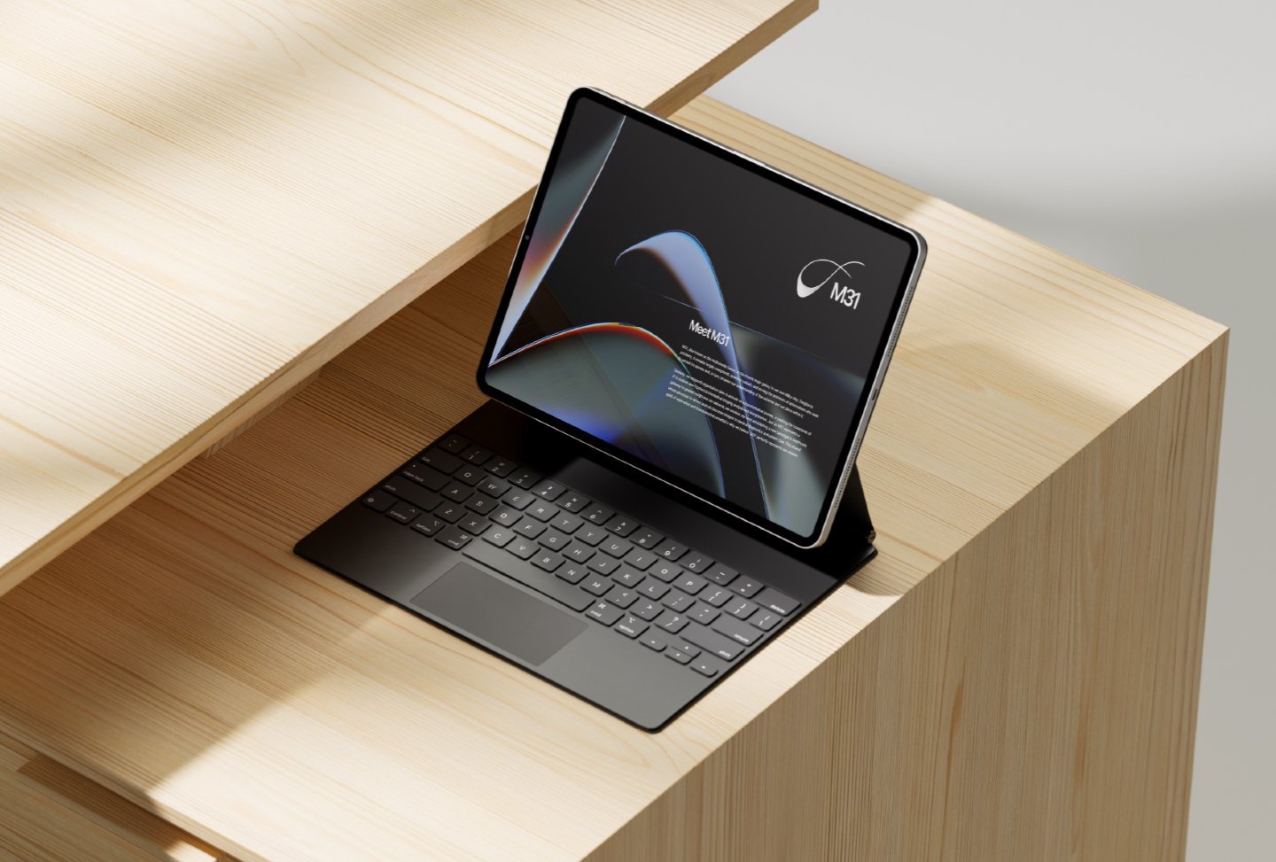
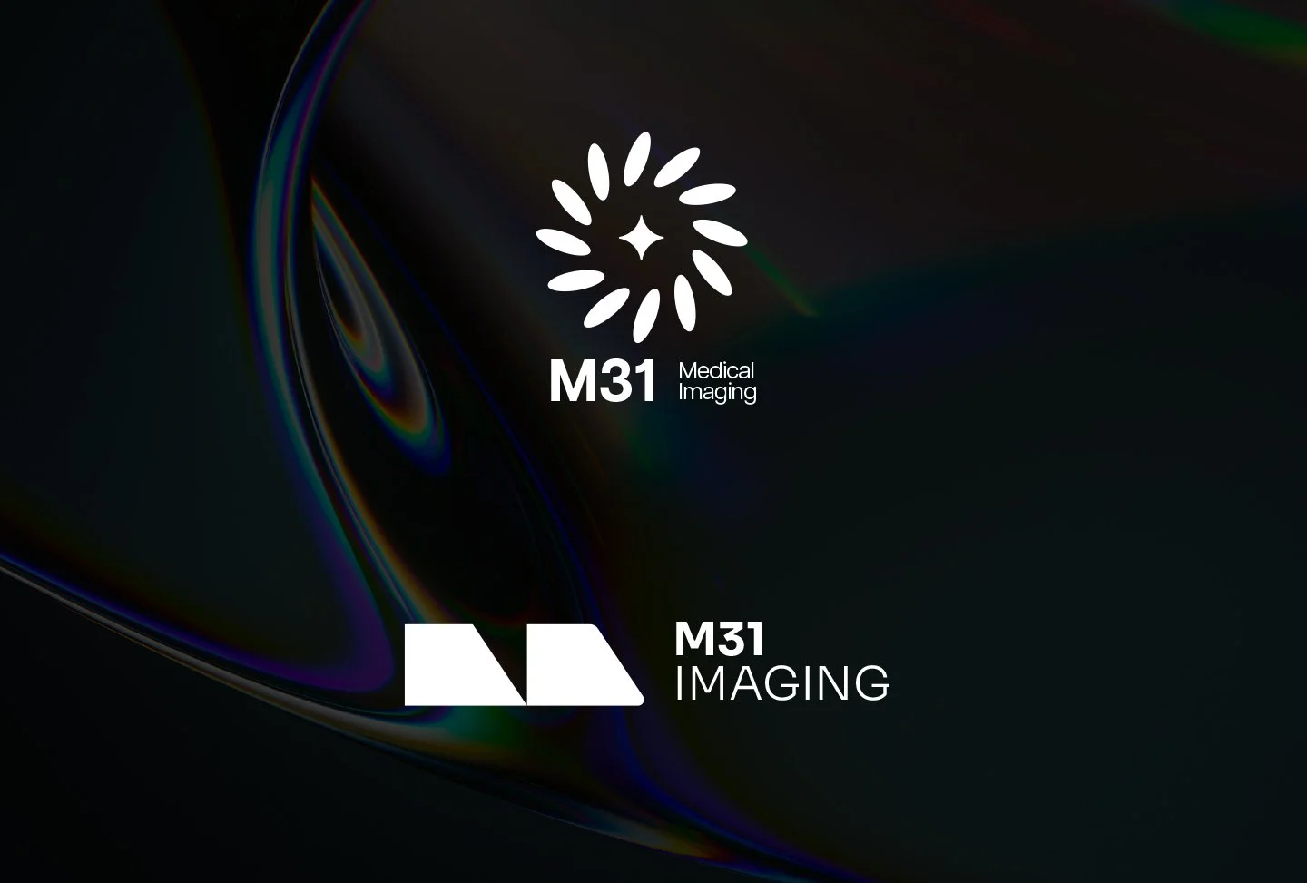
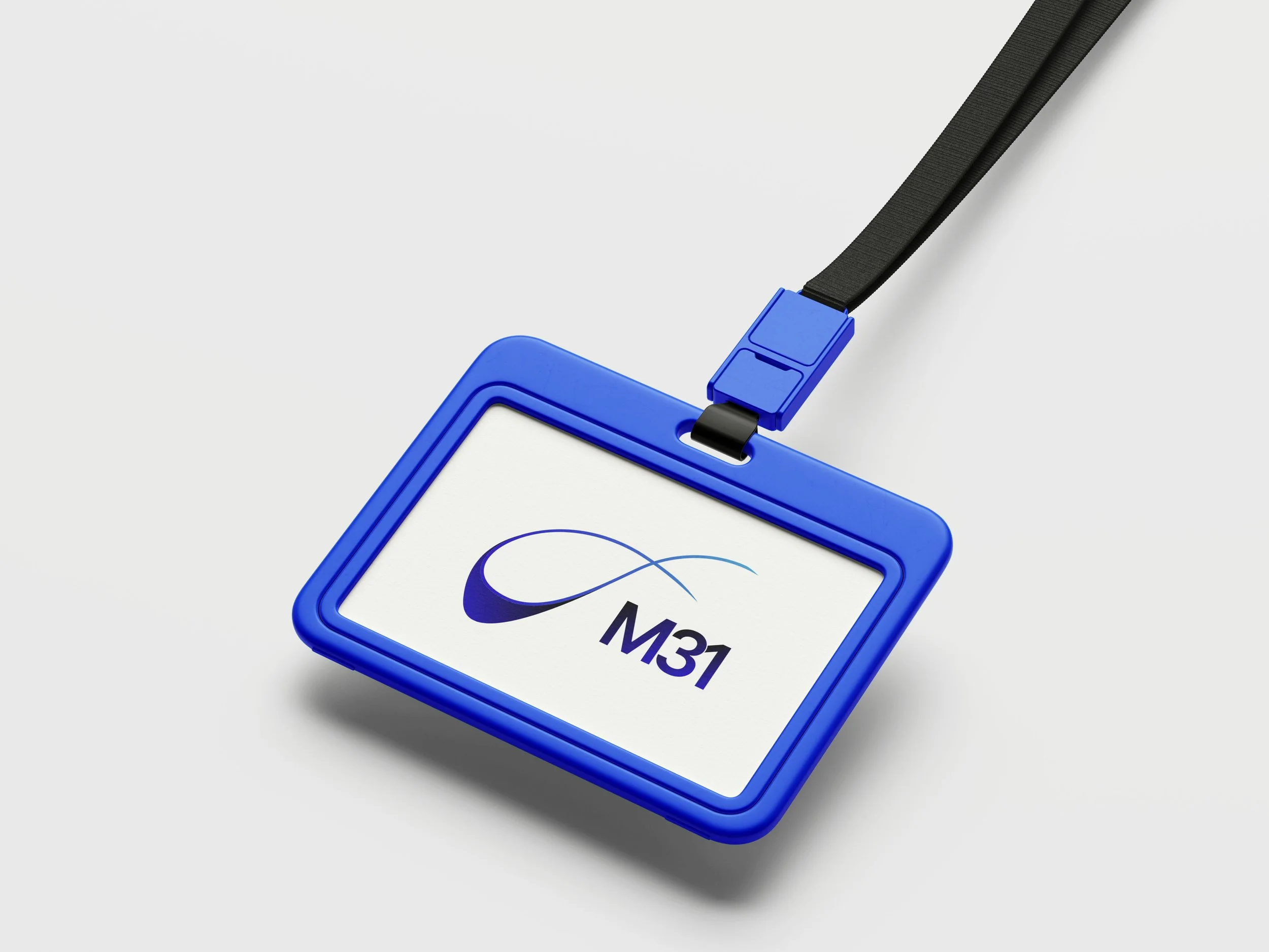
The process started with listening. Working closely with the founder, the focus was on understanding the conceptual foundation they had already built: a company named after the Andromeda galaxy, with a brand that needed to reflect that reference without illustrating it literally. From there, the logo was developed as an abstract geometric form; one that carries the scale and structure of M31 without relying on obvious astronomical imagery. Precise, considered, and specific to them.
The Outcome:
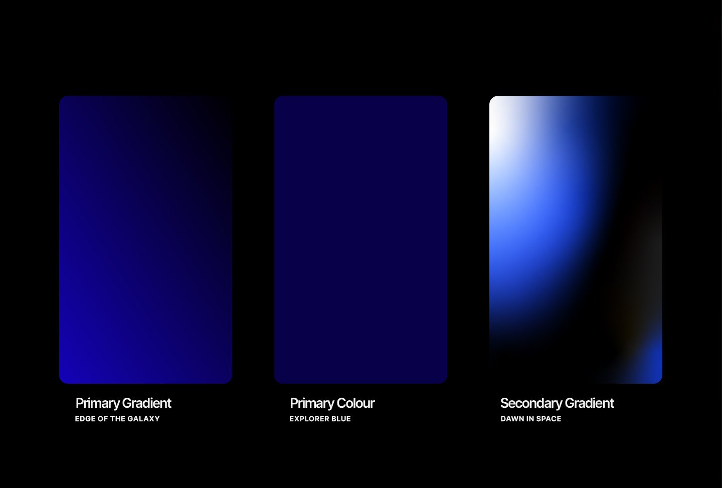
A logo and supporting colour palette the founder has used confidently since launch; an identity that holds its own in a field where most brands default to the expected.
Deliverables:
Logo design · Mini Brand Guide (logo usage + colour palette)