CUPE3902
CUPE3902
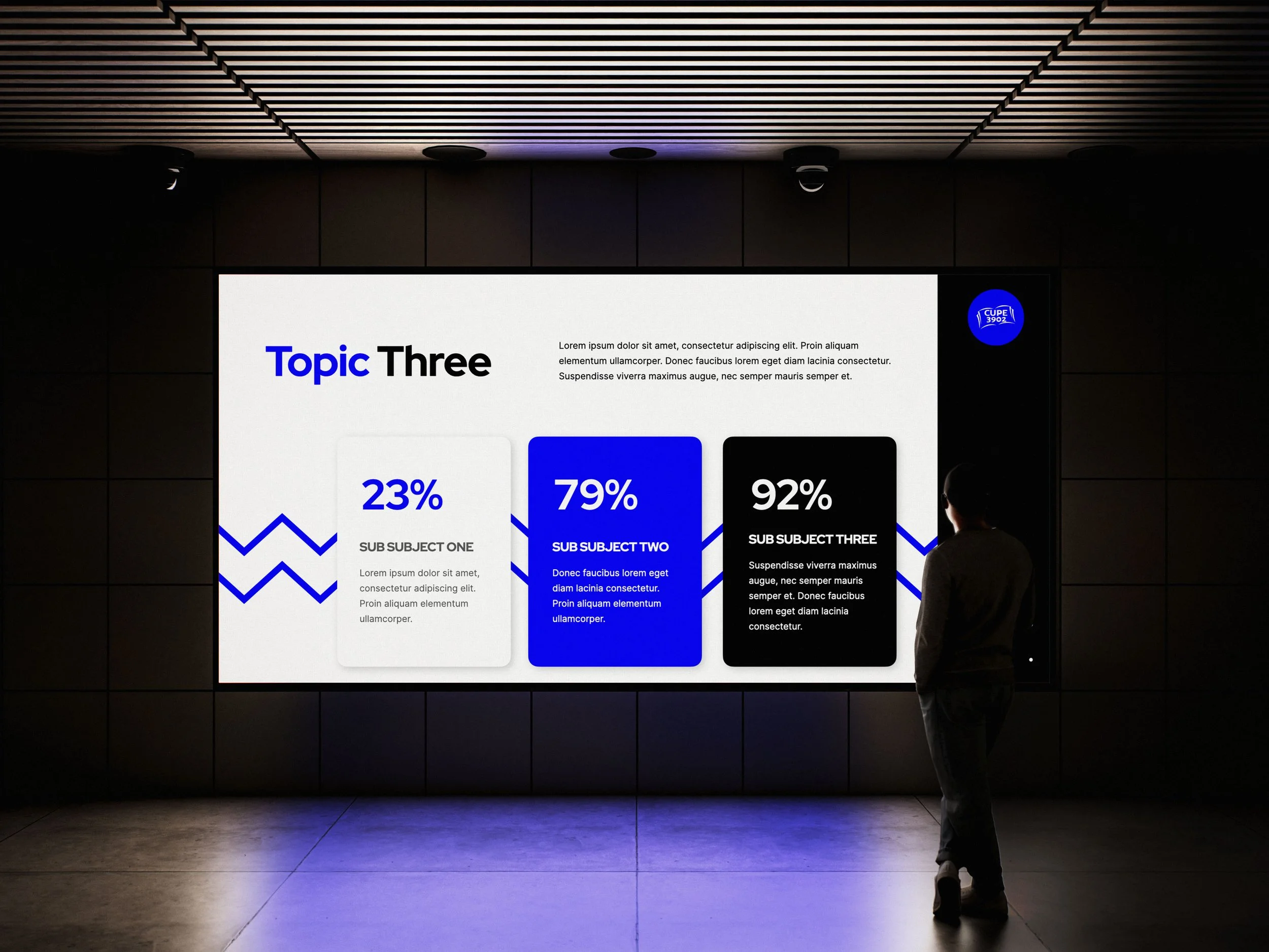
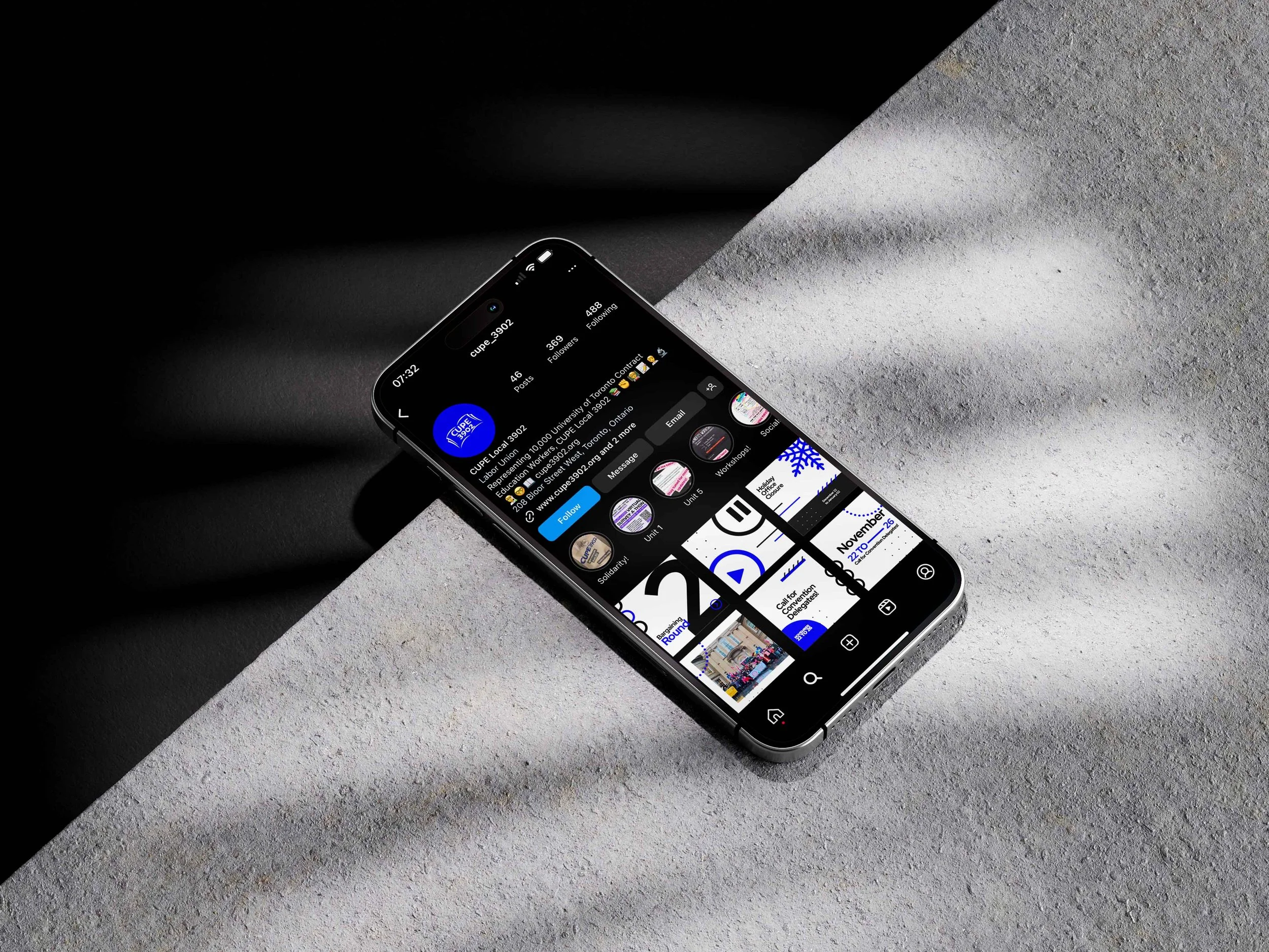
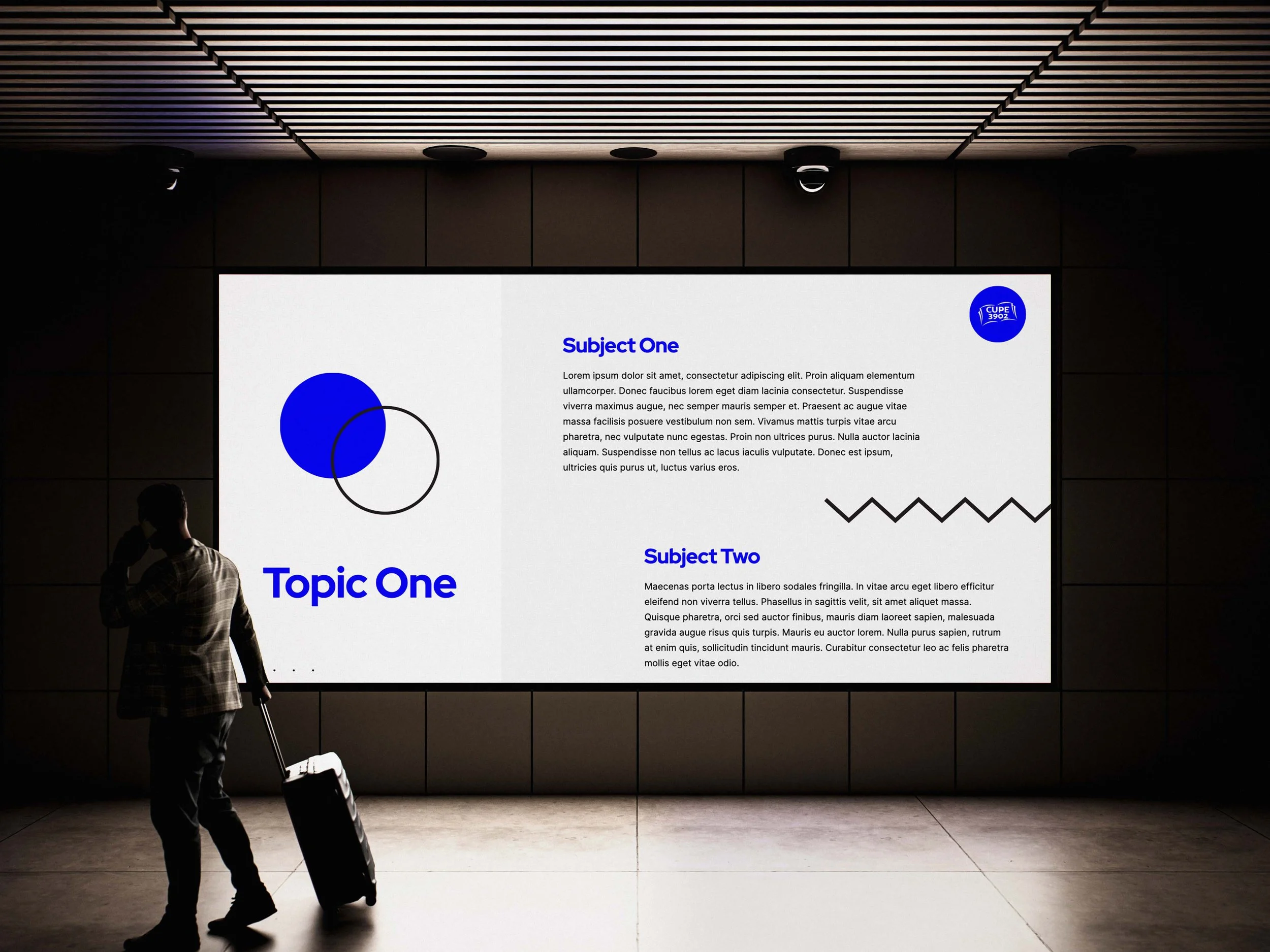
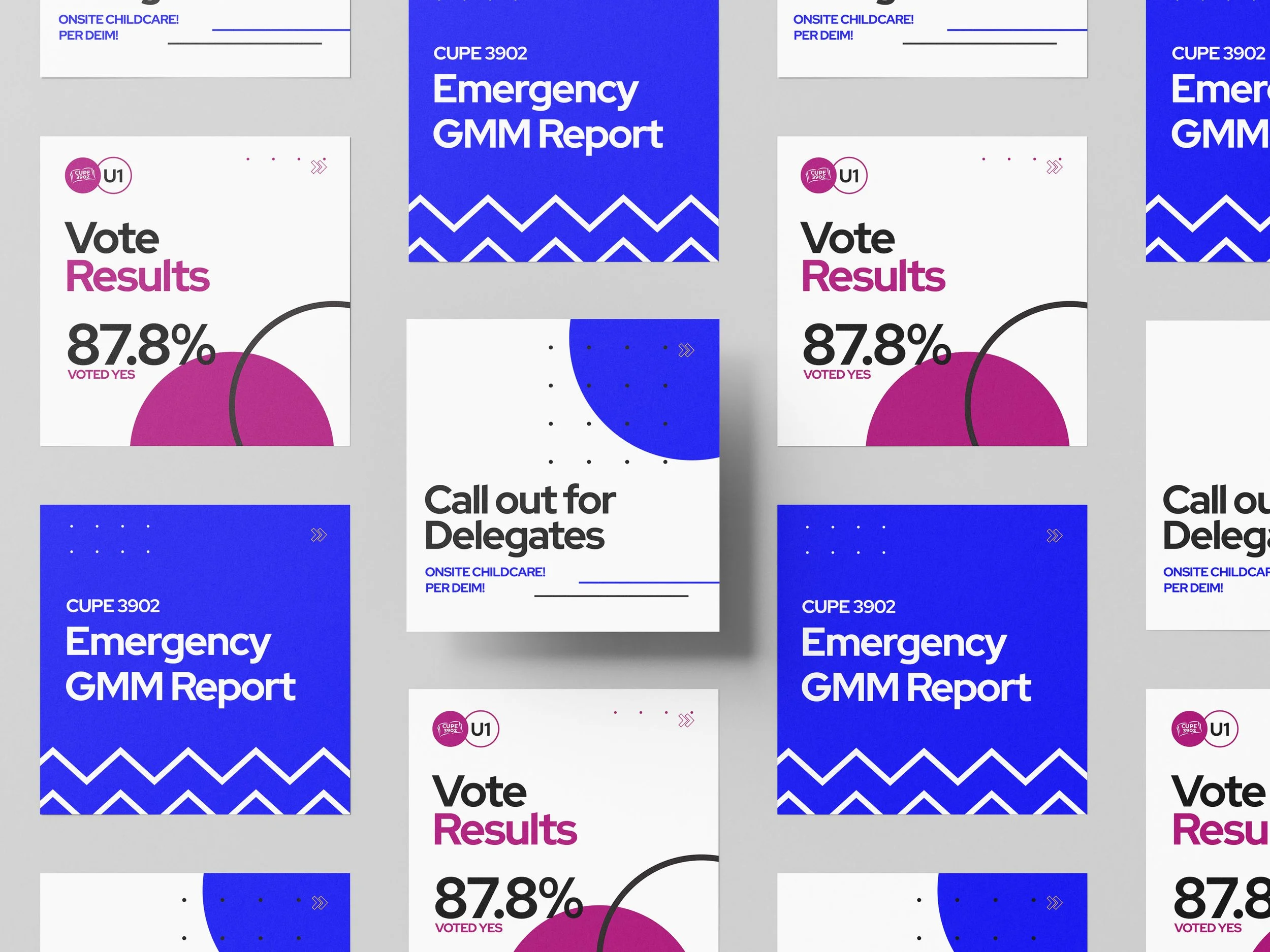
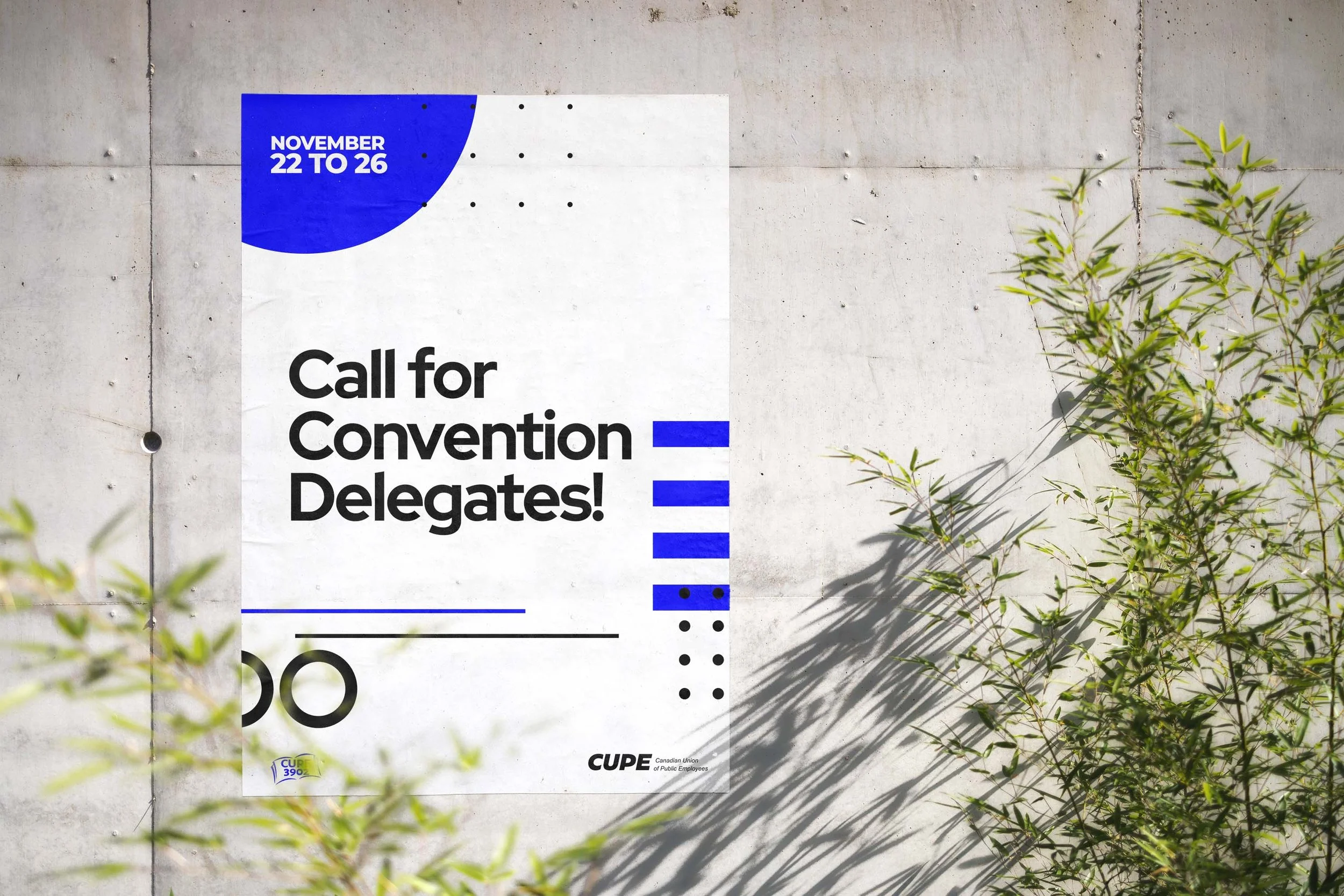
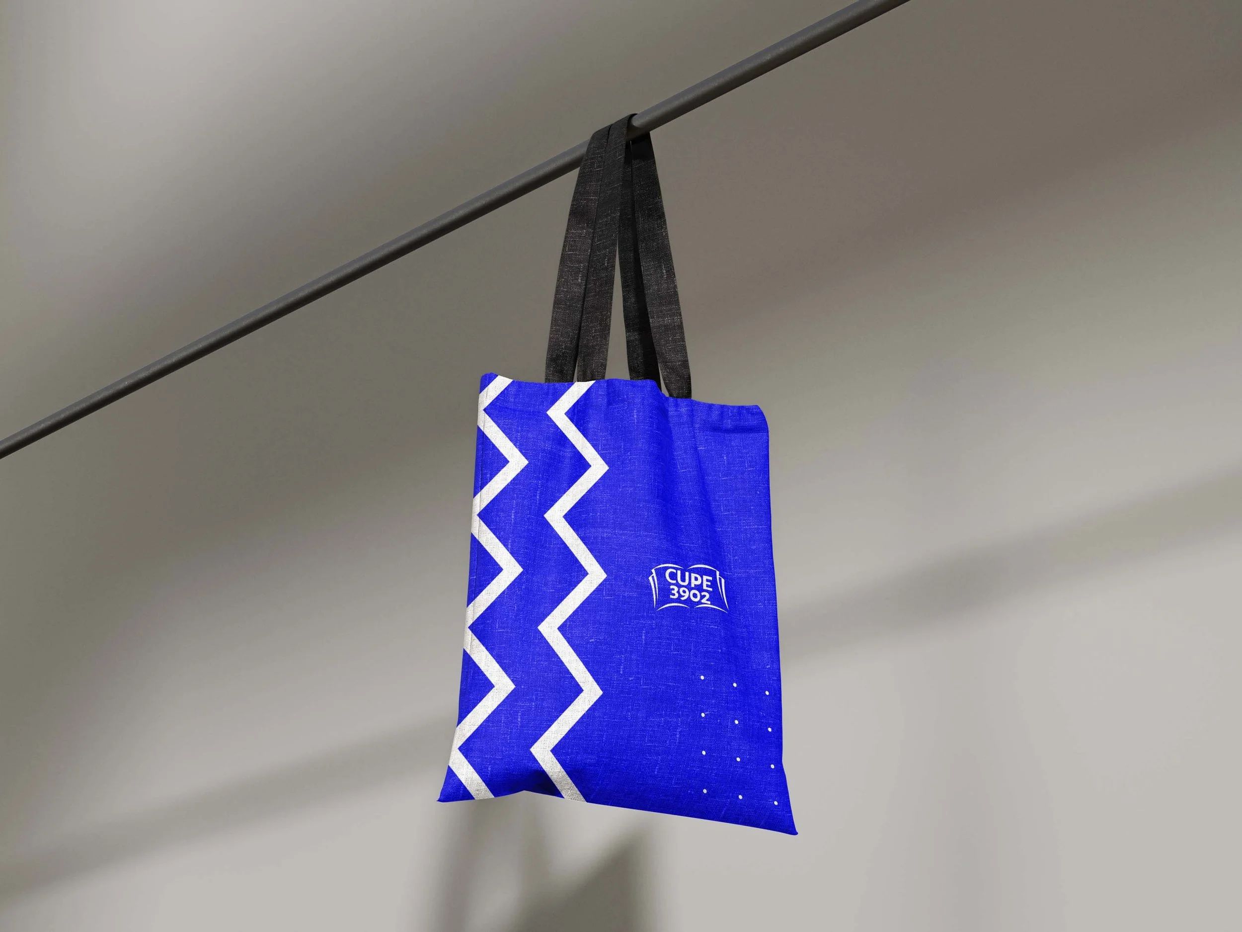
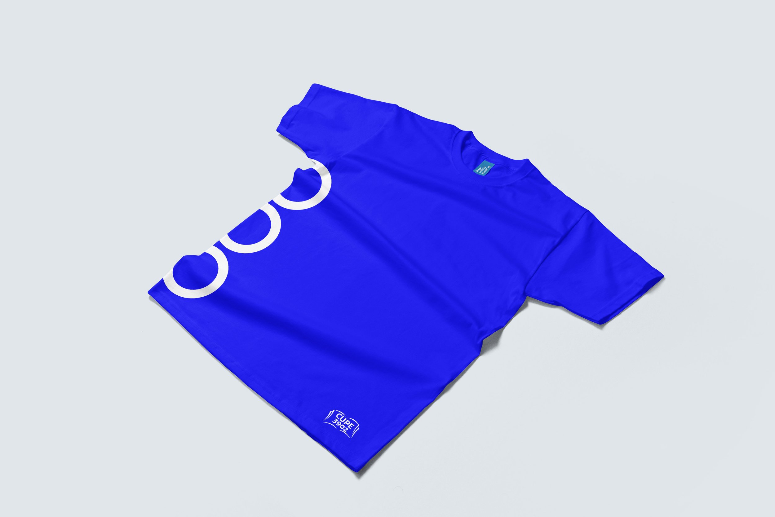
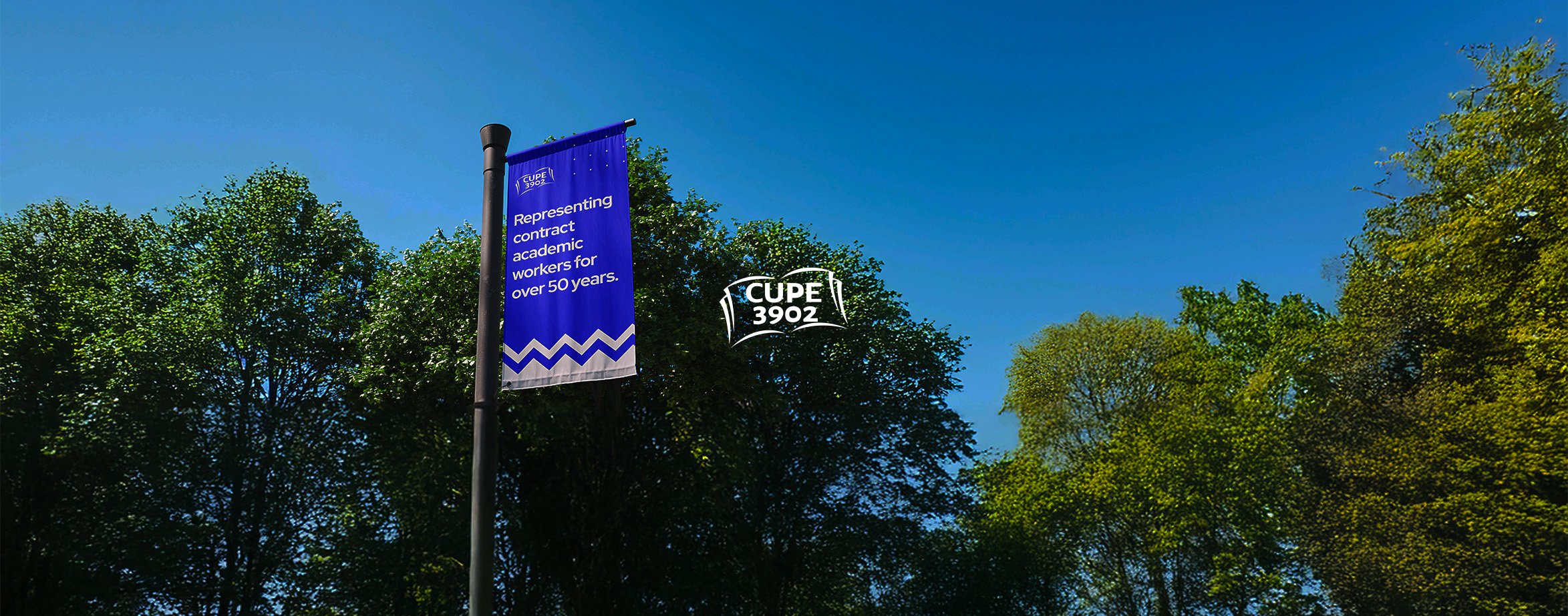
I was brought on to refresh the visual language of a long-standing institution while maintaining its familiar logo. This included developing a full brand guide with updated colour palettes, typefaces, stationery, presentation decks, email signatures, and a comprehensive manual to ensure consistency across all touchpoints.
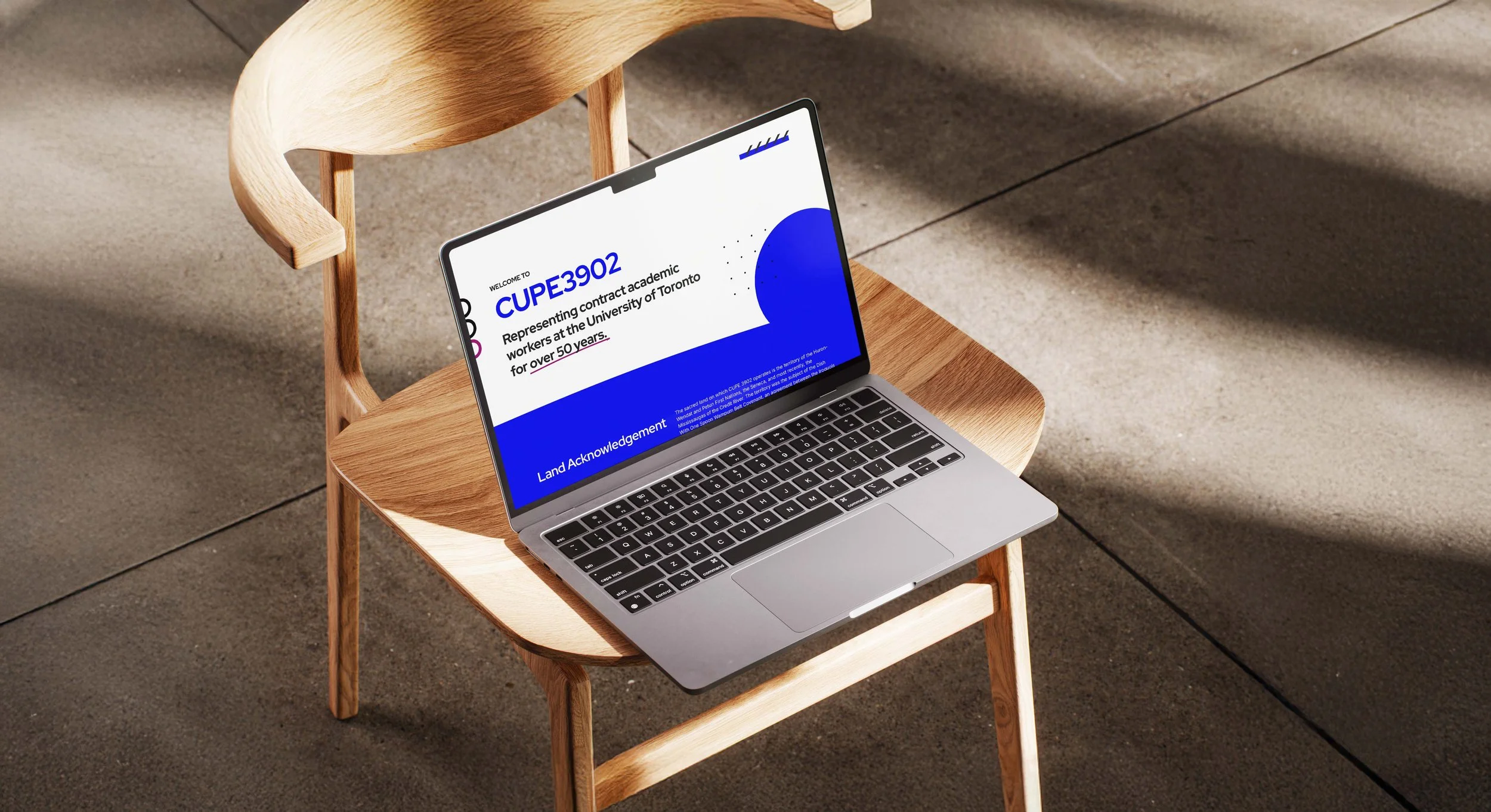
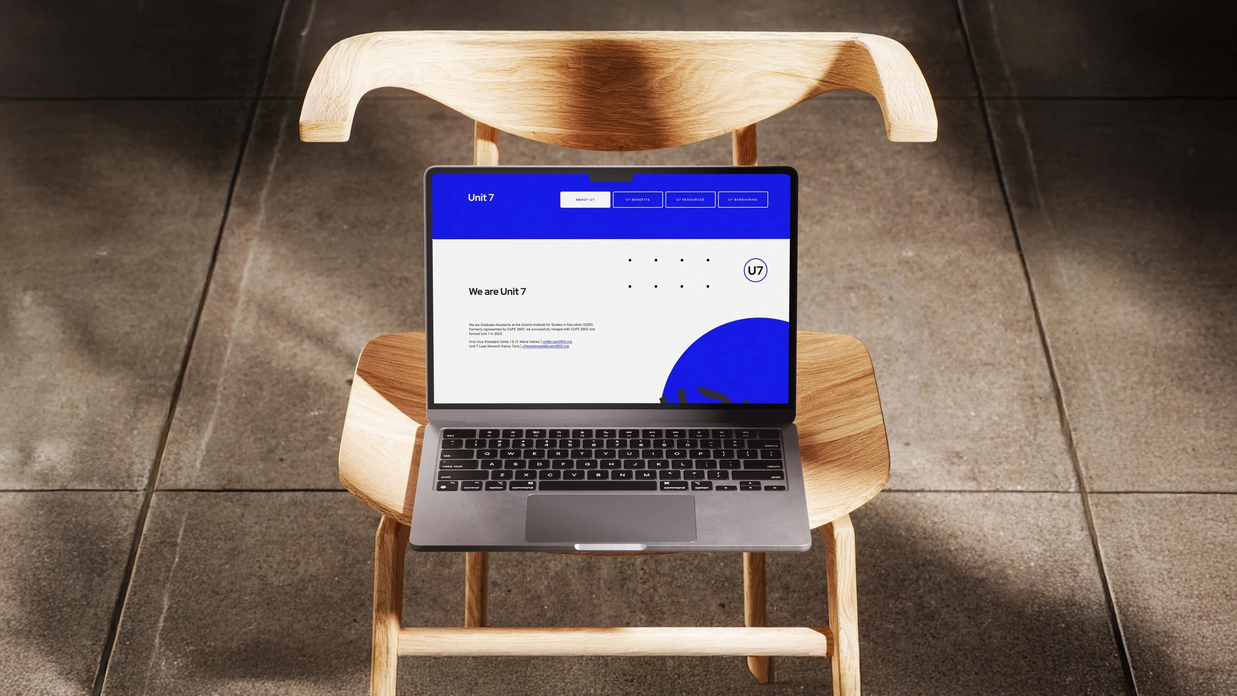
The website redesign went beyond aesthetics, rethinking user experience, navigation, and content placement to create a modern, engaging, and user-friendly platform aligned with the refreshed brand. The outcome is a cohesive, accessible identity that resonates across both digital and physical channels.